Through the Eyes of a Hedge Fund Manager, Series #20
| 11 September 2024
Eriswell Market Insights
Diversification: No Forever Rules in Investing
BY MARK PAGE, MANAGING PARTNER
+44 (0) 1932 240 121
info@eriswell.com


© 2026 Eriswell Capital Management LLP

Nobel Prize winner Harry Markowitz once quipped that diversification is the only free lunch in investing.
His insight was simple: by diversifying across multiple asset classes, investors can achieve higher returns
without increasing risk.
A free lunch in other words. For which reason standard financial theory prescribes investing in a
diversified portfolio comprised of stocks, bonds, real estate, commodities, cars, wine, art, basically
everything.
But what precisely is the risk of this market portfolio compared to investing in individual asset classes
such as stocks and bonds?
An interesting paper was recently published by Ronald Doeswijk and Laurens Swinkels examining the
supposed benefits of investing in a so-called “Global Market Portfolio” (portfolio comprised all investable
assets around the world), and then examining the risk/reward characteristics of this portfolio over time.
Their conclusion that no obvious free lunch exists was unexpected by mainstream finance, although look
a bit deeper and things get murkier ...maybe it is available after all.
Either way, it’s worth understanding what’s going on and then taking an extra jump to consider
their findings in the context of today’s zero-r* world.
So, let’s take a look:
To begin, this paper defines its Global Market Portfolio as all assets owned by financial investors around
the world held in the ratios depicted in Fig 1. Note that the real estate category would be much larger if
it included residential real estate, farmland, and infrastructure, but much of this isn’t really tradeable on
public markets.
Fig 1: Composition of the global market portfolio
The most important thing to remember about zero-r* conditions is that there is no conventional
business cycle. We now live in a somewhat bizarre nonlinear world characterised by multiple semi-stable
equilibria, some of which persist for many years and some—like the ongoing inflationary spell— for only
a few.
Turning to the underperformance of value stocks today, notice how value also performed terribly in the
run-up to the 2000 Tech Bubble (Fig 1, red dotted line).
Now imagine if, at the end of 1999, you had finally thrown in the towel and bought tech.
Because in March 2000 tech stocks began to implode. Over the next decade to March 2010, the S&P 500
index delivered a negative return 0.7% per annum, dragged down by the S&P 500 Tech sector which
averaged a negative return of circa 8.0% per annum. Meanwhile the S&P 500 Energy sector delivered a
healthy gain of circa 9% per annum, and this 2000-2010 period also witnessed an outperformance of
small caps and emerging markets.
Turning points like that carry a risk for even the best institutions: Getting the flow of things kind of right,
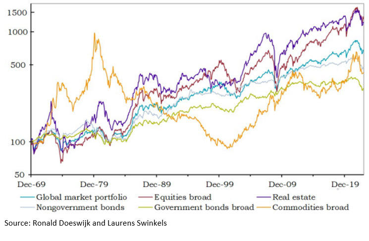
acting too early, then end up chasing hFig 2 depicts the cumulative returns achieved since 1970 by
investing in each individual asset class. Notice how closely aligned equities and real estate have been
over the longer term. Although bear in mind that stocks have massively outperformed bonds in 2023-24
after the dataset used in this study had terminated.
Optically the data suggests that for higher risk investors, stocks and commercial real estate are the best
assets to hold over the longer-term. Those with a lower propensity for risk might opt for a more
diversified Global Market Portfolio, and those with the lowest risk tolerance might choose a bond or
even a money market portfolio.
Exactly as conventional finance would prescribe.
Fig 2: Cumulative total returns for the Global Market Portfolio and its asset categories (USD, log y-axis)
Now here comes the fly in the ointment, according to Doeswijk and Swinkels:
“Despite its diversification across all globally invested assets, the global market portfolio does not have the
highest Sharpe ratio compared to the five asset categories over our 53-year sample period. Its Sharpe ratio is
only slightly higher than that of equities broad, but lower than that of nongovernment bonds.”
In plain English, at first glance diversification is a bit of a waste of time, there is no free lunch!
Note: For those unfamiliar with the concept, Sharpe ratios compare the returns achieved by an
investment against the inherent risk it carries; in other words, it tells us about the quality of returns. A
higher Sharpe ratio is considered better because it implies a higher investment return compared to the
amount of risk the investment carries. A lower Sharpe ratio vice versa.
Returning to the argument, the paper’s findings fly in the face of mainstream finance. Because it found
that a diversified portfolio delivers only a slightly higher Sharpe ratio compared to single asset
categories like stocks, with the only asset delivering a higher Sharpe ratio being government bonds. It
suggests there is no benefit to the quality of returns associated with a well-diversified portfolio.
Or simply, there is no free lunch!
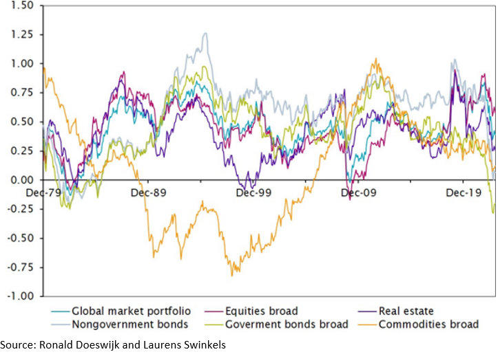
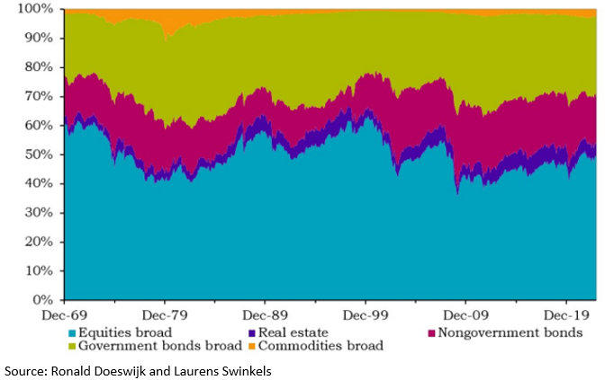
You can kind of see this optically in Fig 3, which illustrates the rolling Sharpe ratios of the different asset
classes. Notice how similar the Sharpe ratio for Global equities is to that of the Global market portfolio.
But now focus on the Sharpe ratio of the Government bonds broad asset class which has demonstrated
the best Sharpe ratio of all over time. This higher Shape ratio is one reason why pension portfolios
contain large allocations to bonds.
It is also why prior to 2022, many UK pension funds felt confident enough to chance their arm leveraging
Gilts via LDI strategies (Liability Driven Investing). Devising strategies around leveraging overpriced
bonds would prove disastrous.
Ever since year-end 2021, government bonds have performed terribly with those investing in such funds
losing up to 70% of their money depending on maturity. The collapse was so dramatic that on 28
September 2022 the Bank of England was forced to intervene to stabilise the UK Gilts market as a
consequence of which gilt yields (which move in the opposite way to price) fell by more than 10% on the
day of its intervention.
Returning to the Government bonds broad category (Fig 3), we can optically see what is going on.
Government bond Sharpe ratios bobbed along quite nicely in positive territory for almost half a century
since the 1970s inflation. Up until 2022, when it suddenly plummets below zero as collapsing bond
prices hammered investors.
So, RIP diversification? Not quite...
Fig 3: Sharpe ratios, rolling 120-month periods
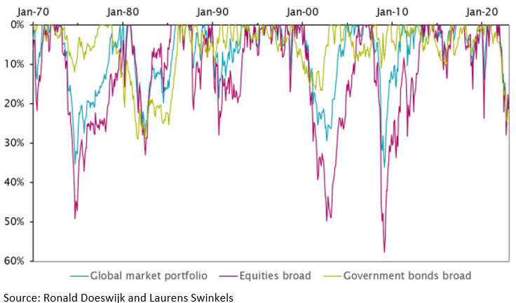
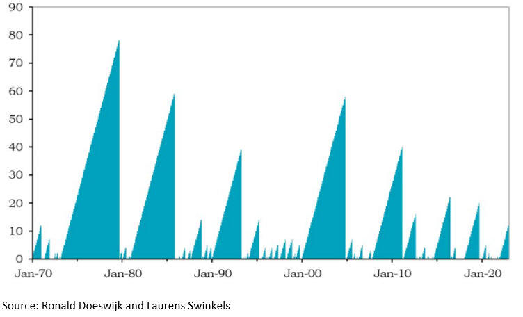
Another way to think about risk—instead of using mathematical measures like Sharpe ratios—is to
consider the magnitude of portfolio drawdowns when they occur (Fig 4) and how long it subsequently
takes for a portfolio to recover the incurred losses (Fig 5). Drawdowns being defined as the maximum
peak-to-trough decline suffered by a portfolio.
Doeswijk and Swinkels describe this in mathematical language:
“However, our newly collected monthly return data allows us to examine the time variation of the Sharpe ratios
of the five asset categories and the global market portfolio. The stability of the Sharpe ratio [for the Global
Market portfolio] over rolling decade samples is substantially greater than that of individual asset categories.
In other words, confidence in a positive Sharpe ratio for the global market portfolio over a decade is highest.”
“.....The risk literature suggests that investors care about the preservation of their capital. Monthly return data
allows us to estimate drawdown risk much more accurately. If we adjust the average returns by drawdowns
instead of volatility, the global market portfolio has the highest reward for risk, and the shortest maximum
drawdown period.”
In other words, it turns that after all, yes, diversification is a good idea for most investors concerned
about smoothing returns over the longer term.
Fig 4: Drawdowns of the global market portfolio, equities broad, and government bonds broad
Fig 5: Duration of drawdowns for the global market portfolio (number of months)
Pre-defined diversification can fail even the best investors
The conclusions to be drawn from this excellent paper will depend on individual investors, their
processes, attitudes to risk, etc. In terms of diversification there is no ‘forever rule’ which everyone can
safely follow in perpetuity.
Put another way, each investor must figure out for themselves how to deal with dynamic
conditions and even the best investors in the world risk catastrophic failure by formulating
‘forever rules’ and then sticking to them.
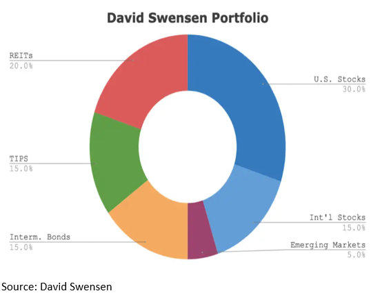
To illustrate this, the best example I can think of is the late David Swenson who ran Yale University’s
Endowment Fund, a man who is widely regarded as one of the greatest institutional investors in history.
Having had the pleasure of meeting him, I would say he was even better than his reputation.
But what I remember most about David was not so much his fantastic mind as his infectious open
mindedness, “Why do you say that?”, “Are you sure about this?”, “Does XYZ bother you?”
Investors as successful as Swenson always attract those who want to copy their portfolios and
outcomes.
To satiate this desire, Swenson designed his “Lazy Portfolio” (Fig 6) to help retail investors vaguely follow
Yale’s strategy over the longer term. This portfolio is well diversified and the weights of the respective
asset classes are rigorously kept in line with pre-defined weightings to maintain the required level of
diversification throughout time.
As it happens this portfolio has performed disastrously since 2020/21 and it has never delivered
the circa 3% outperformance delivered by Yale annually.
Why? Because it is comprised 20% of REITs (commercial real estate) which have performed poorly post
Covid, 15% US TIPS (index-linked bonds) which have performed terribly since 2022, and Intermediate US
Treasury Bonds, which have also performed poorly.
So that’s 50% of the portfolio which has performed badly over the past 2-years. No problem you
may say, that’s just the way diversification rolls.
The trouble is Swenson’s Lazy Portfolio is not even close to mimicking the returns the Yale Endowment
has achieved. Something which would be almost impossible for non-institutional investors, as Yale
follows a unique blend of strategies directed towards private markets, venture capital, alongside niche
and sometimes esoteric asset classes.
The point here being that people so often learn exactly the wrong lesson from great investors like
Swenson, by trying to copy their portfolios as opposed to understanding their insights, analyses, and
processes. alongside the culture Yale has built to help it become as successful it has.
Conclusion
For us, the takeout from the Doeswijk and Swinkels paper is that each investor must figure out for
themselves how to deal with dynamic conditions and that even the best investors in the world risk
catastrophic failure by formulating ‘forever rules’ and sticking to them.
Eriswell’s approach currently revolves around unravelling and understanding the intricacies of zero-r*
worlds, a unique and recent economic phenomenon still poorly understood by mainstream finance. This
has helped us to avoid and even profit from the collapse in sovereign bond prices and commercial real
estate prices since 2021 while benefitting from big rallies in many stocks.
Our same zero-r* insights and models are now flashing a sea of amber warning lights. Taken together
their message is to increase diversification while reducing allocations to the riskiest stocks and bonds.
In the context of Doeswijk and Swinkels, there remains a core logic in seeking to smooth returns and to
protect capital by diversifying over many different asset classes at times of high uncertainty and high
risk. Especially when one is unsure about accurately identifying precise pressure points and the catalysts
which might release them.
Moreover, at such times Eriswell has found that well diversified portfolio provides an excellent vantage
point for potentially violent market moves and a good position from which to intensify allocations as and
when opportunities arise.
Fig 6: David Swensen Portfolio
Mark Page